If can sometimes be difficult to find a cursive font to match your handwriting curriculum. Many fonts claim to be D'Nealian but aren't. And many other fonts don't claim anything at all (for trademark reasons) but might actually be a pretty good match. In this article I look at the distinguishing characteristics of the cursive fonts of two major handwriting curricula: D'Nealian versus Zaner-Bloser.
If you are looking for advice on which handwriting curriuculum to choose, this article is not for you. The differences between D'Nealian and Zaner-Bloser cursive are subtle, and would be a very tiny part of your decision making. The differences between their manuscript fonts and their didactic approach would be much more important to consider. Many articles have already been written to highlight these differences.
This article is only about the cursive fonts of these two handwriting curricula.
Similarities
- The shape of lowercase letters is nearly identical (but read on for a few exceptions).
- The connections between letters are also nearly identical. The letters n, m, v, x, y, z start with overcurves in both fonts. The letters i, j, u, w start with undercurves.
- Connections from the letters b, o, v and w stay close to the midline and do not form an open loop.
Stroke thickness
The D'Nealian curriculum uses a thicker stroke than the Zaner-Bloser curriculum.


Lowercase entry strokes
In D'Nealian cursive, all lowercase letters start with an entry stroke from the baseline.
In Zaner-Bloser cursive, all lowercase letters start with an entry stroke from the baseline, except for the letters a, c, d, g, o and q.

[image created using the School Cursive font]

Slant
Both cursive styles slant to the right, but Zaner-Bloser style slants more strongly than D'Nealian. D'Nealian's slant is about 17°, whereas Zaner-Bloser's slant is about 25°.
Exit strokes
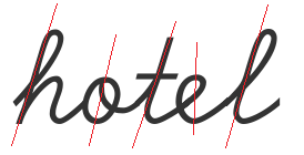
In D'Nealian cursive, letters have short exit strokes ('monkey tails'). In Zaner-Bloser, letters have exit strokes that continue all the way to the midline.
Long exit strokes can make l look like b, and make u look like w.


Specific lowercase letters
Letter p: loop or stick?
In D'Nealian, the letter p has a stick; in Zaner-Bloser, it has a loop. In both fonts, the highest point of the p touches the midline (unlike some European fonts, where it goes through the midline).


The crossbar on the letter t
The D'Nealian letter t has a crossbar on the midline; the Zaner-Bloser letter t has a crossbar somewhat above the midline.


The 'back' of the letter e
In D'Nealian, the letter e has a curved back, resembling the shape of the letters c and o. In Zaner-Bloser, the letter e has a straight back, resembling the shape of the letter l.


Slant of e: The slant of the Zaner-Bloser letter e is the slant of its straight back. This is taught explicitly in the Zaner-Bloser curriculum. The slant of the D'Nealian letters c, e and o can be determined by drawing a straight line from their highest point (touching the midline) to their lowest point (touching the baseline). This line should be parallel to the sticks of other letters. It's important to check the slant of any (non-Zaner-Bloser) e when selecting a cursive computer font, since many fonts get this wrong.

Undercurves inside the letters u and w

[image created using the School Cursive font]

Connections from uppercase letters
In both D'Nealian and Zaner-Bloser, some uppercase letters connect to the next lowercase letters, while others do not. It's also mostly the same uppercase letters that do or do not. However, there are a few exceptions.
Uppercase L
Zaner-Bloser's uppercase L is designed to go under the next lowercase letter, and therefore, can't connect to it. The D'Nealian uppercase L doesn't connect to the next lowercase letter, but no reason can be discerned for that. The little gap with the next letter is so awkward that it looks like a bug in their font. For my own School Cursive font, I have chosen not to mimic this particular oddity of the D'Nealian curriculum.


Uppercase Q
Zaner-Bloser's uppercase Q ends under the baseline and does not connect to the next letter. It's a mystery to me why it's not extended under the next letter like Zaner-Bloser's letter L.
D'Nealian's Q connects to the next letter. It's also open on the left side, making it look like the numeral 2.


Uppercase I
What do all these letters have in common?

[image created using the School Cursive font]
Answer: these 6 uppercase letters - B, F, G, I, S and T - all contain a curved, more or less horizontal stroke. In earlier cursive styles, this stroke would extend all the way to the next lowercase letter. In both D'Nealian and Zaner-Bloser however, these letters are not connected to the next lowercase letter, but a small part of the historical connecting stroke is retained.
Except... in D'Nealian style cursive, the I is connected to the next letter, but only because it's written backwards. Instead of ending the letter with the remnant of the old connecting stroke, students are expected to start the letter with it. This makes it possible to connect the I to the next lowercase letter, but it is historically inaccurate, as well as inconsistent with how the same stroke in the letters B, F, G, S and T is written.
Zaner-Bloser's uppercase I starts just below the baseline and ends with the same horizontal stroke that the B, F, G, S and T also end with. Most of the I is therefore written from right-to-left, but that is the historically correct way to do it. The I does not connect to the next lowercase letter.


Entry strokes for uppercase B, P and R
In Zaner-Bloser, the letters B, P and R start with an entry stroke from the midline. In D'Nealian, these letters simply start from the headline.


Uppercase letters and numerals (nearly) from the headline
In D'Nealian - and in many historical cursive styles as well - there are many uppercase letters and numerals that start from a point slightly below the headline. In Zaner-Bloser, these letters start with an extra stroke from the headline to the "D'Nealian" starting point.

[image created using the School Cursive font]

Some fonts available on the Internet do something analogous with the lowercase letter c: they add an extra stroke from the midline. This is an error: the Zaner-Bloser curriculum does not do this, and such an extra stroke would be very confusing for students trying to join other letters to the letter c.
The "humps" of uppercase M and N


Conclusion
In this article, you learned to spot the differences between D'Nealian and Zaner-Bloser cursive. I hope this will help you to select a computer font to match the handwriting curriculum you use.
Because this article focused on differences between D'Nealian and Zaner-Bloser, not on the similarities, not all potential pitfalls when selecting a computer font have been explained. For more things to be on the lookout for, read my article Why so many cursive fonts disappoint... and what distinguishes the good fonts.
Neither Zaner-Bloser nor Savvas (the publisher of the D'Nealian curriculum) sell their fonts. There are no fonts available on the Internet that are 100% identical to the fonts used in these handwriting curricula. Always use your own judgement when deciding whether a font is a good fit with your other handwriting materials. That said, I can make the following recommendations:
- The School LOE font by David Occhino follows the D'Nealian style closely and offers a very complete set of font styles (tracing fonts, with arrows, etc) as well as matching manuscript fonts.
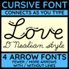
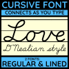
- My own School Cursive font - available on TeachersPayTeachers - is by far the cheapest D'Nealian style font out there. I offer styles with and without guides (lines) as well as with arrows, but dashed or dotted styles for tracing are still in development.
- The Schoolhouse Educational Handwriting Fonts are the most expensive, but available in both D'Nealian and Zaner-Bloser style.
- Log in to post comments
D'Nealian style cursive font - fully connected - FREE DEMO

D'Nealian style cursive font - fully connected - FULL VERSION
D'Nealian style cursive font with arrows - fully connected