If you are a primary teacher, you probably use letter outlines. They are a fantastic resource for students to decorate, or for you to decorate with instructions in the form of arrows, numbers, or a dotted trail. You can laminate them and let students trace over them with their fingers or use them as a play-dough mat. Or you can not laminate them and let students go to town with glue and glitter. They also save you a lot of ink compared with silhouette letters. Anyway, outline letters have a lot of uses in the classroom.
Let me tell you a little secret... you don't need to buy outline fonts to create outline letters.
You can use Microsoft Word to convert any letter or piece of text into its outline.
Below, I'll tell you how.
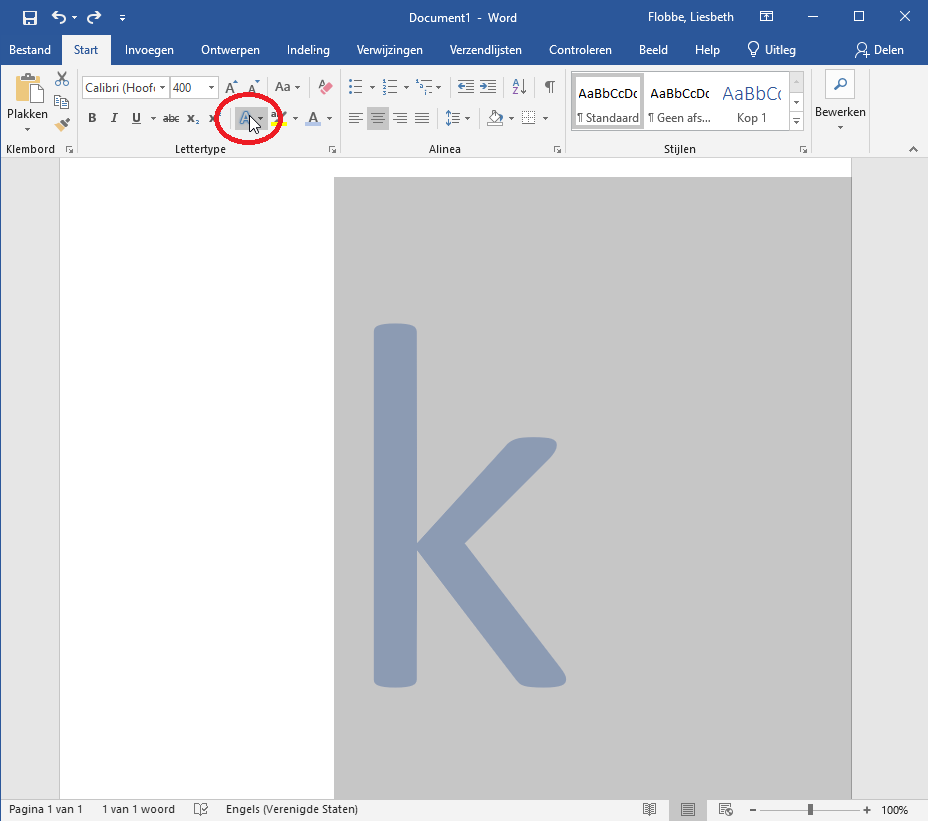
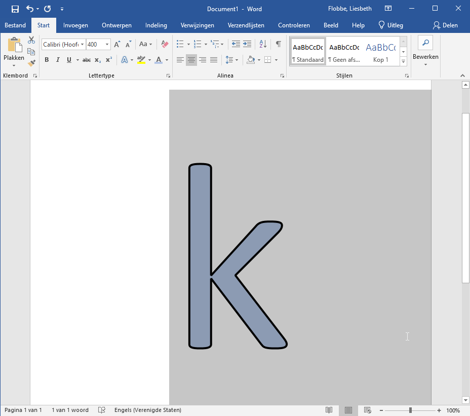
First things first. Let's create a normal letter (let's call it a silhouette letter). We need to change the color of the letter to something that is not black and not white, otherwise we won't be able to see what we are doing. This is just temporary; at the end of the process we turn the letter white and we will be left with a black outline. But for now, the letter needs to be a color. Let's also enlarge the letter to the size at which we will be using it, so we can get a better idea what kind of outline thickness will work best.

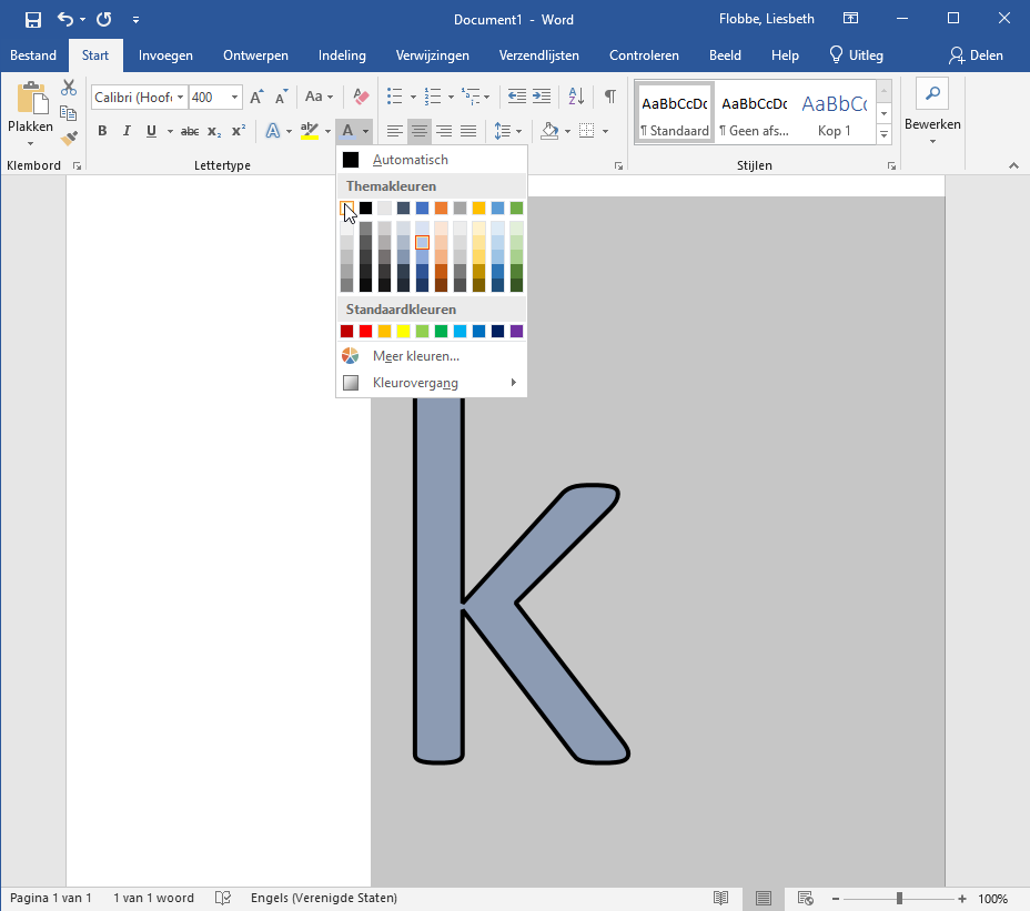
Our next step is to select the letter and click on the icon with the 'glowing' letter. If you mouseover, you'll find out it's called Text Effect and Typography.
Unfortunately, the text in the screenshots is not in English but in Dutch. IT won't allow me to change that. Fortunately, with a bit of internet sleuthing I was able to find the English names for all the buttons. So please ignore the text in the screenshots themselves.
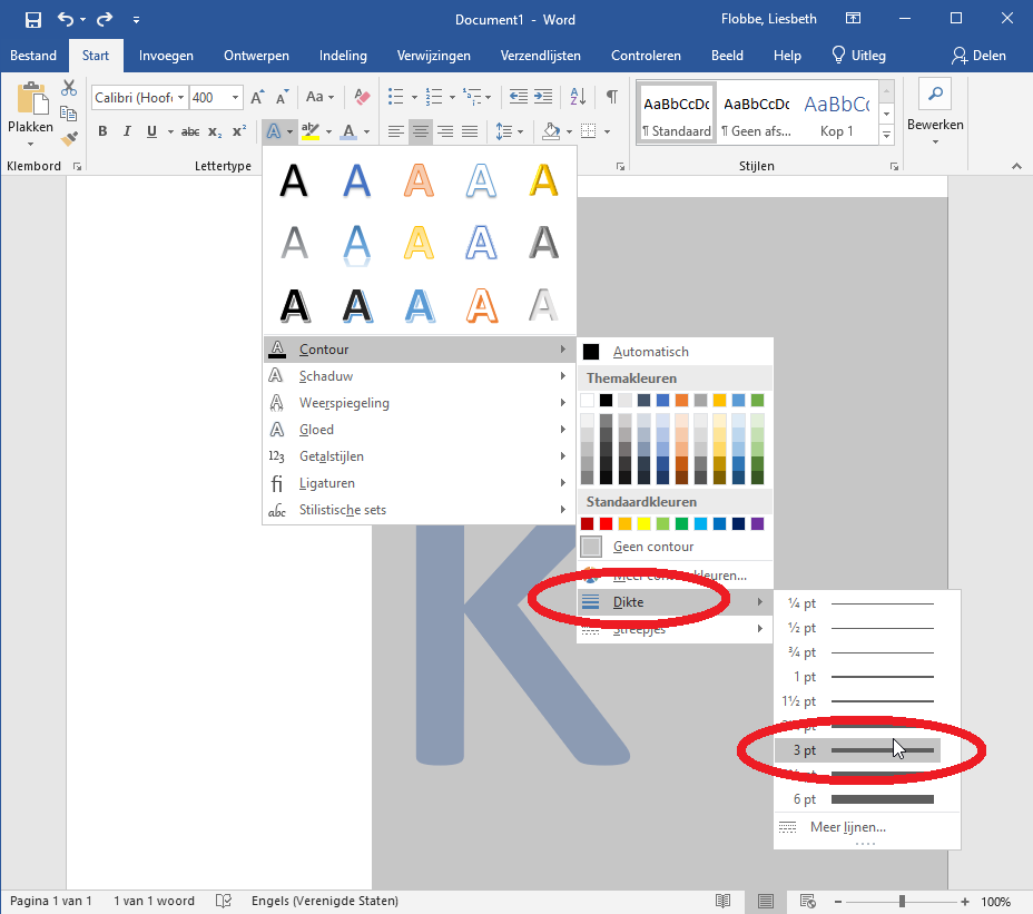
With the menu expanded, click on Outline, the top textual item in the menu.

In the now even more expanded menu, click on Weight, and pick a weight that looks good to you.
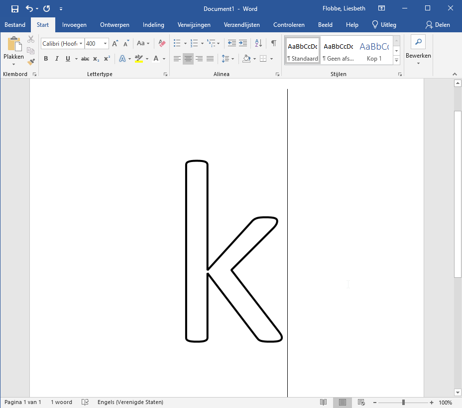
When you clicked a weight, the menu closed, and you can now admire the result.
Have a look at the result. Does this look like a good weight (line thickness) to you? If not, repeat steps 2 - 4. When you are satisfied, select the text and change the color to white.
This is the final result:
You can now save or print your outline letter!
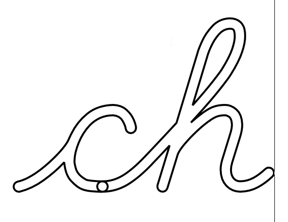
Problems with joined up text
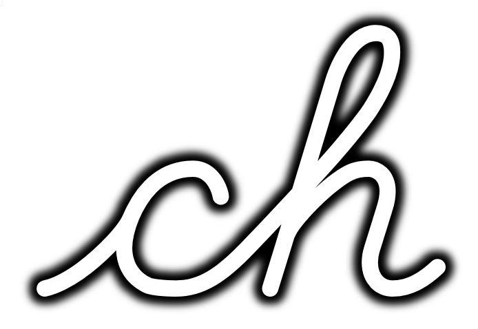
This method will work perfectly well for cursive text... as longs as it's only one letter. If you try to turn 'joined-up' text into outlines, you will probably see overlap between the letters.
There is one other text effect available in Microsoft Word that doesn't show this overlap. That's the 'Glow' effect. If you limit the effect to 1 pixel, it looks like an outline rather than a glow shadow. You can only use this to create very thin outlines; thick outlines will end up looking like glow shadows.

So are there still good reasons to buy outline fonts?
Some fonts are only available as outline fonts and not in a normal (silhouette) version. Generally, those fonts tend to use very thick strokes and I tend to avoid them. But if that's your preference, you can purchase an outline font.
If you purchase an outline font, you have no control over the weight (thickness) of the outline.
Are there good reasons to buy PDFs with ready-made outline letters?
There are still lots of reasons to buy PDFs with ready-made outline letters. First, the font used to create the outline letters might not be available, or might be more expensive than the PDF. Second, the PDF author may have added other elements that are worth buying, such as:
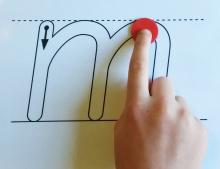
- guidelines on which the letter is placed (baseline, midline, headline)
- arrows or other instructions on how to make the letter
- a picture of a word that starts with the letter
I hope you found this article useful, and wish you much success in creating and using outlines of your favorite fonts.
If you don't want to create your own outlines, have a look at the ready-made PDFs in my TeachersPayTeachers-store. If you do want to create your own outlines, have a look at my fonts.
- Log in to post comments
Outlines of letters - lowercase and digraphs - D'Nealian cursive
Outlines of letters - uppercase and mixed case pairs - D'Nealian cursive
Letter formation cards and charts - continuous stroke manuscript, lower case
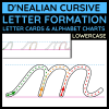
Letter formation cards & alphabet charts - D'Nealian cursive - lowercase