
The official D'Nealian workbooks are published by Savvas and can be viewed on their website.
I've created a D'Nealian font and I'm selling various workbooks and editable worksheets made with this font, but there is one particular feature of the official D'Nealian workbooks that I have not replicated in my materials: the way in which the line is divided vertically.
Ascenders and descenders
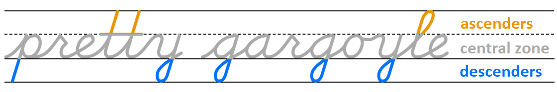
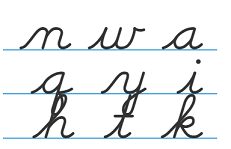
Ascenders and descenders are a defining characteristic of lowercase letters - both in cursive and in print. Letters can be thought of as occupying up to three vertical zones:
- The central zone is used by all letters. Letters that only occupy the central zone, are called ‘small’ letters: e, o, a, n, etc.
- The ascender zone is the space used by the sticks and loops of the ‘tall’ letters: l, h, t, etc.
- The descender zone is the space used by the sticks and loops that stick out underneath the baseline, that occur in the letters: f, g, j, p, y, and (in cursive) z.
In most cursive typefaces in use in the United States, these three zones all have the same height. This is the case for both the D'Nealian and the Zaner-Bloser typefaces.
Dividing the line in three vertical zones
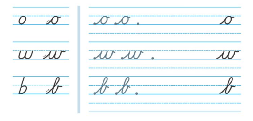
Given that letters have three vertical ‘zones’, it would be sensible and straightforward to divide each line in three zones. That is exactly what happens in the D'Nealian workbooks for grade 1 and 2:

Dividing the line into two vertical zones
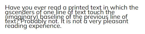
Starting from the first cursive unit in grade 3 (after some manuscript review), D'Nealian divides the line into two equal zones. This dual division means that ascenders and descenders overlap each other. Ascenders touch the baseline of the preceding line of text. Descenders touch the ‘small’ letters and overlap the ‘tall’ letters and uppercase letters.

Dividing the line into two vertical zones is bad for readability
The D'Nealian workbooks teach students to divide the line in two zones, and to write ascenders in the same zone as the previous line's descenders. It is possible for ascenders and descenders to overlap and this overlap can make letters unreadable. Even when there happens to be no actual overlap, there is lots of ‘touching’ between letters, and very little white space between lines. The lack of white space makes it hard to track which line you're on and causes a generally unpleasant reading experience.

This crowded, overlapping writing style is not how I write, and not how I want my children to learn to write!
If you're still not convinced about the poor readability of overlapping ascenders and descenders, consider how you never encounter this in print:
Dividing the line in two zones is taught poorly
How do the D'Nealian workbooks teach students to divide the line into two vertical zones? Not very well. When students return to grade 3 after the summer holiday, their writing workbooks present them with the new style of lined paper - with two instead of three zones - quite suddenly. This switch happens at exactly the same time that the workbooks stop using a pink baseline and make all lines the same color. If a student was reliant on the pink color to identify the baseline, they are going to be quite confused.
To make it even more confusing, on the first pages of the first cursive unit in grade 3 (and later also on the first pages of the grade 4 workbook), where individual letters are reviewed, entire lines are skipped. This creates some much needed distance between letters, but it can also confuse a student about on which line they should write. In grade 2, every third line was a baseline, and it was pink for easy identification. In grade 3, students are supposed to identify every second line as a baseline. But exercises that skip lines can leave students with the impression that only every fourth line is a baseline.
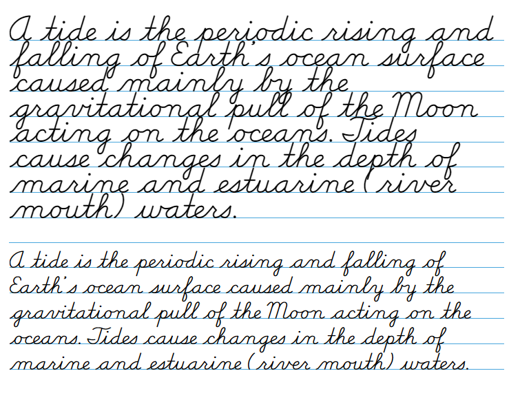
Line skipping is one of the ways in which the D'Nealian workbooks avoid showing text with overlapping ascenders and descenders. Another way to avoid showing overlap is by choosing specific letters and words, and by ordering those letters and words in a specific order, so that overlap is avoided. An example of this kind of manipulation can be found here:
But if we hadn't carefully put all the letters with descenders on the last line, the same sample text might instead have looked like this:
Not very readable, is it?
Yet a third way in which the D'Nealian workbooks manage to avoid showing overlapping ascenders and descenders, is by sometimes dividing the line in three zones instead of two. The workbooks do this whenever they show unlined text (text that is not written on any lines). Students are expected to copy samples of unlined text onto lined paper. But since the students have been taught to make their ascenders touch the previous baseline, their text will never look the same as the sample text, but will instead become a crowded and overlapping mess.

If overlapping ascender and descender zones are such a desirable feature of student writing, why do the workbooks not use them in unlined sample text?
To summarize:
- the D'Nealian workbooks switch from a division of the line into three zones to a division into two zones in grade 3
- the workbooks complicate this switch by dropping the pink color from the baseline at the same time
- the inevitable result of this line division into two zones, is that ascenders and descenders sometimes overlap
- the workbooks go out of their way to avoid showing this overlap in their sample text
- the methods used to avoid showing this overlap (skipping lines, using a different line division for unlined text) may further confuse students
One ‘advantage’ of dividing the line in two zones: you never need to learn to write small
There is one ‘advantage’ to dividing the line in two zones: your letters can be 50% larger than they would be if you divided the line in three zones. This means students can transition to standard ruled paper sooner, and that they won't need to spend a lot of time practicing how to write smaller. Students who use the D'Nealian workbooks switch to writing on standard lined paper (with only baselines, no other lines) almost a year earlier than students who use the Zaner-Bloser curriculum. In fact, the entire D'Nealian handwriting curriculum ends a year earlier than Zaner-Bloser.
But, how easy it is to teach a style of handwriting says nothing about whether that style is a worthy end goal of handwriting education! Small handwriting is a very desirable outcome in and of itself: it is faster and requires less hand movement than larger handwriting. It also uses less paper, even if you keep the distance between baselines the same: someone who writes smaller will be able to fit more words on every line and will therefore need less lines. Writing small - within reason - is desirable because it is small, and that advantage comes on top of the readability advantages of not having letters overlap and having appropriate white space between lines.
Using resources that divide the line in three zones
The workbooks and worksheets that I've created for TeachersForTeachers divide the line into three zones, and use a full set of helper lines: baseline, midline, and topline. Because I divide the line into three zones, the topline is separate from the baseline.
As long as you use resources with a full set of helper lines, you don't need to instruct students on how to divide the line. They still remember from grades 1 and 2 how to write on paper where the topline and baseline are separate and will probably not even notice that the lining is different from that in the official D'Nealian writing curriculum [just like many students and teachers never notice that unlined and lined sample text in the same D'Nealian writing workbook divides the line in different ways]. Some students may need help in identifying the baseline, though, especially if it's not pink.
Transitioning to standard ruled paper
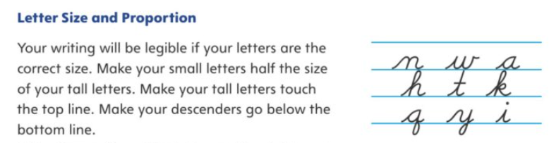
However, when your students start to transition to standard ruled paper (with only baselines and no helper lines), they need explicit instruction on how to divide the line. In the official D'Nealian workbooks, this explicit instruction tells them that tall letters should touch the baseline of the preceding line of text, and that small letters should be half the size of tall letters. If you want to (continue to) divide the line into three instead of two zones, you need to explicitly instruct students that tall letters should not touch the preceding baseline, and that the height of the small letters should be one third of the distance between baselines. In addition, students need to learn to write smaller, but I think it's not a good idea to remove all the helper lines and expect students to write smaller at the same time... To read more on how I think you can best help students with this transition, read How to transition your students to wide ruled paper.
I have a lot more to say about how to transition to standard ruled paper. In fact, I'm planning to create a new TPT resource with editable worksheets, to help with this transition. But that will become the topic of a future article.
- Log in to post comments
Handwriting paper to gently transition from 3/8" fully lined to wide ruled paper

Editable handwriting worksheets in D'Nealian cursive
Editable handwriting worksheets in D'Nealian cursive - from 3/8" to wide ruled
