In my previous article I discussed what makes creating a cursive font hard.
In this article I will look at less and more successful solutions that have been invented by font designers to solve the problem of cursive.
Omitting connections
The simplest solution is to omit some of the connections between letters:

Although this is perfectly acceptable for a decorative font that is just trying to evoke the feeling of handwritten cursive, it's not something we want students to emulate. For teaching purposes, we can't use such fonts.
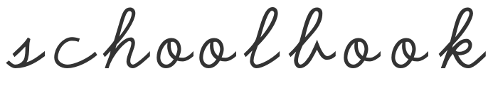
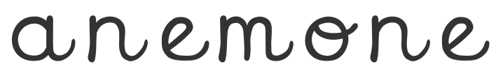
How to spot these fonts: check for letter combinations starting with b/o/v/w, and especially combinations where the second letter is a tall letter (b/f/h/k).
Meeting halfway
A very common approach to dealing with cursive connections is, to decide that all letters have to meet all other letters at the same height: exactly halfway between the baseline and the midline. All letters begin and end with a bit of connecting stroke at that height. Because all letters begin and end at the same height, they can all connect up.
In isolation, the letters look like this:
And this is what it looks like if you use the font ‘normally (without artificially separating the letters like I did above):
The most obvious problem is how that the connections from the letters b/o/v/w have to dip very low, very far towards the baseline. That's not how we teach children to connect these letters in school. With my oldest child, I couldn't distinguish o from a in his handwriting, so I have spent a lot of time teaching my child to make his a's go all the way down to the baseline before connecting, and to stay close to the midline after an o. The low-dipping o's in these fonts undermine such teaching and are exactly the sort of in-between letters that we shouldn't want children to produce! (The same goes for the difference between v and u, which is also something that students can struggle with, and that these fonts cause confusion about.)
These fonts have other problems beside the letters b/o/v/w.
Remember how I said that in handwritten cursive, the connection towards the e has to be extra wide so that it doesn't bump into previous letters? But if all letters have to connect to all other letters halfway, you can't really do that. So this is the result:
First, we see that the e is too close to the previous letter. And second, to stop the e from literally bumping in to the previous letter, we see that the downstroke had to curve away from that letter as fast as possible. As a consequence of that ‘get out of the way’ curve, the lowest point of the e ends up positioned too far to the right. While all the other letters are leaning to the right, the e alone ends up with a shape that makes it look upright (or is some fonts: left).
How to spot these fonts: Look at the connections from the letters b/o/v/w; do they dip low? Also check the slant of the letter e. The word ‘cursive’ is a good word to test the font with.
Meeting at the downstroke
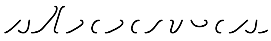
If letters meeting each other halfway between baseline and midline is a problem, maybe we can let them meet up somewhere else? One solution seen in some fonts is that letters meet at the downstroke of the next letter.
In isolation, the letters look like this:
And joined-up, it looks like this:

The advantage of meeting at the downstroke is, that it gives the font designer a lot of flexibility about how high to meet up. We see a meeting up with n very low down, but we also see o meeting up with an identical letter n very high up. Connections from the letters b/o/v/w don't need to dip low in this font; they can stay close to the midline.
Unfortunately, there are at least three disadvantages of meeting at the downstroke.
First, there is very little space between the letters. It's all very narrow.
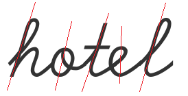
Second, fonts like this can't connect with overcurves. They can only connect with undercurves. Both the D'Nealian and the Zaner-Bloser styles of cursive taught in school teach children to use both undercurves and overcurves for connections, like this:
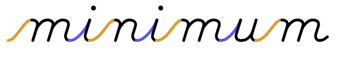
But if you connect letters at the downstroke, overcurves are impossible. All connections must use undercurves.
And the undercurves that must be used when you connect at the downstroke aren't a little bit curvy like in D'Nealian, they are very curvy, so curvy that you curve ends up merging into the (future) downstroke at a very low point.
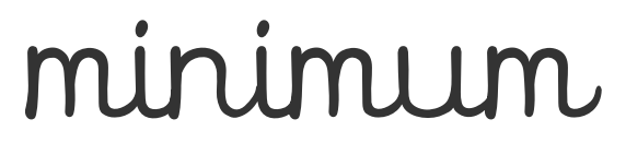
That brings me to the third problem: What do you think it says is the picture below?
If you think it doesn't say anything, that it's just a pre-writing ‘pattern’ that repeats itself four times, I wouldn't call you wrong. But it's supposed to be the Dutch digraph uu: two times the letter u. How can you tell? You can't. The problem with using these low-merging undercurves for connections between letters, is that they are indistinguishable from curves already found within letters. Like within the letter u.
This way of connecting letters makes it hard to distinguish the letters from the connections. That is especially problematic for children, who - as beginning writers - are still struggling to keep track of where they are and what they need to do next when writing a single letter. If they have to connect letters in a way that they can't tell the connections apart from the letters, their working memories will get overburdened and they will skip or repeat letter fragments.
How to spot these fonts: You probably wouldn't select these fonts anyway since the overall impression they give is so different from how you learned to write. The defining characteristic is the low location of merging into the downstroke.
Handmade letter variants
We saw what happens when a font designer tries to connect every letter to every other letter halfway between baseline and midline, and didn't like the result. We saw what happened when a font designer tries to connect every letter to every other letter at the downstroke, and we didn't like that result either.
Maybe font designers shouldn't connect every letter to every other letter?
Maybe font designers should make multiple variants of each letter to the alphabet; variants designed to connect only to some letters but not to all.
Welcome to the world of letter variants!
Since we're only halfway down this article yet, you might think I have a problem with letter variants. I do not. I think letter variants are great! My main problem with letter variants is that most font designers use too few of them.
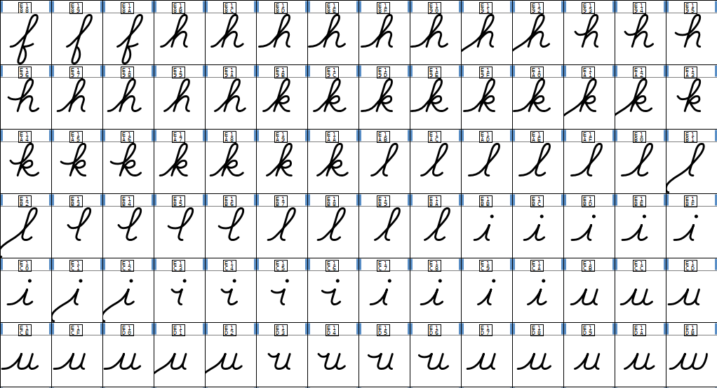
I found a D'Nealian cursive font made in 1996 on a free font website. Looking at the font in a font editor, we find this:

First, we see the 26 ‘default’ letters, which are the form of the letter that is suitable in most contexts. We also see at least one other variant of every letter of the alphabet, which is the variant that is suitable for use after b/o/v/w. Finally, we see that the letters b/o/v/w have two additional variants, which are suitable for connecting to e.
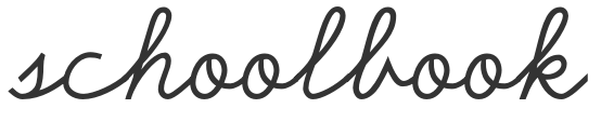
If we use the correct letter variants, the word ‘schoolbook’ in this font looks like this.
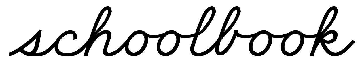
Compare that to the previous ‘schoolbook’ in this article, and it's a huge improvement. The connections from the letters b/o/v/w are exactly how they should be.
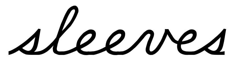
And here is the word ‘sleeves’:
And for comparison, this was the word ‘sleeves’ at the top of the previous article that I used as an example of ‘natural’ handwriting:
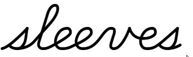
The 1996 letter-variant version of ‘sleeves’ is looking quite OK, actually. But if you must make a judgement which ‘sleeves’ looks more natural, I'd think you choose the bottom one. If you look at the top version, there's a flat bit along the baseline at the end of every e and s. That flat bits helps to keep an appropriate distance between letters, without having to give every letter of the alphabet a special variant just for connecting from e or s.
It's understandable that the number of letter variants in this font from 1996 is limited to the absolute minimum. They are hard to make, and - until OpenType support became common among consumer application - they were also hard to use. Back in 1996, end users would have had to insert these variants manually through the ‘Insert Symbol’ dialog in their word processor.
Newer fonts however are able to substitute letter variants automatically while you type.
How to spot these fonts: The connections from b/o/v/w look good in these fonts. It's usually around the letters e and s that you can spot subtle shortcomings. If you've bought a font that appeared to have good connections from b/o/v/w in the promotional material but doesn't have them when you type something, it's possible that you have to insert the letter variants manually.
Multi-letter ligatures
Not every font designer knows how to substitute letter variants. It's actually quite complicated, because the rules you have te write must take into account all possible outputs of all the other rules you've written and must be able to process those outputs as their own inputs.
And a lot of handwriting fonts are created by teachers, not by professional font designers, let alone font designers who can program.
Some well meaning amateur font designers have found an interesting way to program substitutions without using contextual alternates.
Instead of substituting one letter at a time depending on context, they substitute multiple letters at a time regardless of context. To do that, they make ligatures: special ‘glyphs’ in the font that are made up of multiple letters. Instead of a letter variant of n to be used after b/o/v/w, they create four ligatures bn, on, vn and wn.
But maybe you already see the problem... instead of one letter variant per letter of the alphabet, you need four ligatures per letter of the alphabet. And it doesn't stop there. It's not enough to create 26 ligatures for every letter that ends at the midline, you also need 26 ligature for every ligature that ends at the midline. So the ligature oo triggers the need for 26 more ligatures: ooa, oob, ooc... all the way until ooz. In fact, there's no upper limit to how long the necessary ligatures can become: for the word ‘hobbit’, you'd need the four letter ligature obbi, ‘snowboard’ needs the five letter ligature owboa.
This solution is a dead end. Don't go down this path.
How to spot these fonts: Try some letter combinations starting with b/o/v/w that don't occur in your language, like vwv. You'll quickly find letter combinations that are not supported by the font.
Splitting up letters
If we want all connections to flow smoothly from one letter to the other, font designers should stop thinking of ‘default’ letters that can be connected directly to each other versus ‘variants’. As long as font designers think like that, the temptation will be high to use the default in as many letter combinations as possible, even when a variant would be more appropriate. The redundancy between letter variants is also a problem, because it makes revisions and improvements a lot of work, and is another reason to keep the number of handmade letter variants limited.
A more advanced solution is to reduce letters to just their ‘invariable’ part, and put all connecting strokes in separate glyphs. A font that does this, would have a glyph inventory looking something like this:
To write a three letter words with this font, you'd need to input 7 glyphs: entry stroke - letter - connecting stroke - letter - connecting stroke - letter - exit stroke.
To write the word ‘sleeves’ in this font, you'd use the following 15 glyphs (here separated for clarity):
Spoiler alert: if you put those glyphs together (with the necessary overlap, but that's something the font does automatically), you get the word ‘sleeves’ from the previous article; the word I used as an example of natural handwriting.
Inputting those glyphs by hand is not humanly possible. The required substitutions also can't be programmed into the font itself. They have to be done with ‘external’ software. That external software could be a Visual Basic macro in Word, or a script on a website.
If you'd use a font like this in a Word processor, it would be quite cumbersome. You wouldn't be able to edit cursive text with all these special (and sometimes very narrow) glyphs in it . You'd have to convert the text to non-cursive with a macro first, do your edits, then convert it back to cursive.
The output produced by these fonts can be perfect. Of course, the actual quality still depends on the font designer, and how willing they are to make special connections for edge cases like e or s or r. But a font like this can be revised and improved incrementally without the designer having to re-do a lot of work and without much risk of introducing errors or inconsistencies.
How to spot these fonts: These fonts are not easily available to the public, given how hard they are to use. You might encounter fonts like this by stealing them out of a web application.
Edit (October 2024): the information above turns out to be incorrect. It is possible to program the required substitutions into an OpenType font. To do this in OpenType, you invoke a number of ‘multiple substitution’ tables from within the ‘contextual alternates’ table. Even so, there are quite a few fonts I admire whose glyph inventory consists of non-overlapping, non-redundant parts and that use ‘external’ software for glyph substitution.
The real solution: generating letter variants from non-redundant parts
If we want the quality output of ‘split up’ fonts and the usability of OpenType contextual substitutions, what we need to do is automatically generate letter variants that can be substituted from the kind of loose, non-redundant parts we saw in the previous section.
If you do this by hand, not only is it a lot of work, but you wouldn't be able to do revisions or improvements without redoing all that work. No, you have to program your font design software through an API to automatically generate these letter variants.
The glyph inventory of the resulting generated font looks something like this:
And yes, that 's only six letters in the picture. The entire alphabet doesn't fix even fit on my screen.
But with this glyph inventory, the word ‘sleeves’ can be made out of the following glyphs:

That's exactly one glyph per letter, and that means that we can program the required substitutions into the font itself. To do this, we use the OpenType feature ‘contextual alternates’. It's not trivial: the rules that describe the substitutions must be written in such a way that they can process each other's output as their own input. But it's possible.
The end result is a font that connects the letters as you type. The connections will also adapt when you edit the text.
A font with handmade letter variants could in theory be just as good as a font wih automatically generated letter variants. But practically, if the font designer doesn't have an automated process to generate letter variants from non-redundant parts, they are not going to create as many letter variants, and they are not going to revise and improve their font as much, as a font designer who generates their letter variants.
Edit (October 2024): This method is needlessly complicated. If the ‘contextual alternates’-table links to ‘multiple substitution’ tables instead of ‘single subsitution’ tables, there is no need to generate letter variants; the underlying non-redundant parts can be invoked directly from the ‘multiple substitution’ tables.
Conclusion
There are many cursive fonts out there, and there are huge differences in quality. There is no need to ever settle for a font that butchers the connections from b/o/v/w or the slant of the e. Font designers already knew how to fix those problems more than 25 years ago.
If you are a teacher looking for a cursive font, let me start by congratulating you on getting through this very long and very technical article. If you are looking for a D'Nealian style font, you should check out my School Cursive font. It's excellent quality and also an excellent fit with existing curriculum materials.
If you are looking for another style of cursive, I wish you good luck. I hope this article helps to evaluate fonts and make decisions on what to ‘compromise’ on and what not.
- Log in to post comments
D'Nealian style cursive font - fully connected - FREE DEMO

D'Nealian style cursive font - fully connected - FULL VERSION